The making of 15 years of popular chat show in data
When it was announced that the popular talk show ‘De Wereld Draait Door’ was going to stop, there was a wave of interest in both mainstream and social media that wasn’t even dammed by the start of the corona crisis. As Sound & Vision is in possession of all the DWDD broadcasts and a great deal of related metadata, it seemed a natural step to investigate what we could contribute to the discussion. Our final result was a ‘data story’ about DWDD. Watch the video below or read the blogpost.


When it was announced that the popular talk show ‘De Wereld Draait Door’ was going to stop, there was a wave of interest in both mainstream and social media that wasn’t even dammed by the start of the corona crisis. As Sound & Vision is in possession of all the DWDD broadcasts and a great deal of related metadata, it seemed a natural step to investigate what we could contribute to the discussion. Our final result was a ‘data story’ about DWDD. Watch the video below or read the blogpost.

Why a Data Story?
Articles and posts discussing DWDD often quote the same ‘givens’ about the programme. For example, that Matthijs van Nieuwkerk speaks very fast, that women are under-represented and that the programme was unique in the large number of topics covered, particularly in scientific areas. We can use data to test these assertions and see if the data backs them up - or perhaps challenges them.
A second reason for a data story is that it can be hard to get an idea of broader trends and traits of the programme by watching individual broadcasts. As the saying goes ‘you can’t see the wood for the trees’. Data offers a different perspective on the programmes, making it possible to spot trends and patterns that offer new insights.
The third reason to examine DWDD on the basis of its data is to explore the potential of that data. At Sound & Vision we have a treasure trove of content and metadata, and thanks to the technology developed in the Media Suite by the Clariah project, we have an unprecedented ability to explore and analyse this data. We are convinced that metadata offers us great opportunities, and a data story is one way of exploring these opportunities.
Working the Data
For DWDD, we have two types of metadata available. One type is the descriptive metadata that is manually entered by archivists and, more recently, by the broadcaster. For example, a short summary of the programme, lists of the people involved and their roles, and the topics discussed. The second type of data available is automatically created metadata, produced by software. This software can recognise who appears in the programme, who is speaking and what they say. It can also extract people, locations and subjects from the subtitles.
Unfortunately, we don’t have the same metadata available across DWDD’s full history. Fifteen years ago, when the show started, metadata was entered manually by trained archivists. Now, as the DWDD era draws to a close, metadata is predominantly obtained by automatic means. This transition began in 2014, so both types of metadata are amply present for DWDD programmes.
Both types of metadata have advantages and disadvantages. For example, manual data about people appearing in the programme is highly accurate, but, due to the limited time available to the archivist, it is limited to the people deemed important at that moment in time. Speaker detection software, on the other hand, will pick up speakers not deemed famous at the time of broadcast, but who acquired such status later. However, the software cannot tell us if the person was a guest in the programme, a presenter, or simply appeared on a clip that was shown.
The different characteristics of these two types of metadata make it unwise to combine them without careful consideration. Take locations, for example. If an archivist fills in ‘Rotterdam’ in the location metadata field, then we know that Rotterdam was a significant location in the programme. Software that detects the word ‘Rotterdam’ in the subtitles cannot tell us if Rotterdam was the programme location, the subject of discussion, or a passing reference in an anecdote - ‘As I was coming back from Rotterdam…’.
We therefore cannot analyse trends in locations by simply comparing the number of programmes which are tagged with the placename ‘Rotterdam’, as the meaning of the tags has changed over time with the shift from manual to automatic annotation. Does an increase in tags for Rotterdam show the city gaining prominence over time, or is it due to the software applying tags based on different criteria than a human archivist? For this reason, we analysed the different types of metadata separately for the DWDD data story.
The data story included many different data visualisations. Here, we will examine three in more detail, Dutch locations, scientific subjects and presenters.
Dutch locations
We calculated the most frequently occurring locations in the Netherlands featuring in DWDD, using the archivist metadata to be certain that the place name was indeed a significant location. Initially, we plotted the top ten most frequently occurring locations. Such a cut-off can be misleading, however, as it would then appear that the city Hilversum is not discussed at all, while it is actually at number eleven, with the same number of results - 5 - as number ten. Instead, we plotted all locations occurring more than once in the programme, both globally and within the Netherlands. These plots suggested a lot of interest for the U.S. and for the largest Dutch cities.
Figure 1: The most frequently discussed locations in 15 years DWDD, on a global scale (annotated by archivists)
Figure 1: The most frequently discussed locations in 15 years DWDD, on a global scale (annotated by archivists)
Figure 2: The most frequently discussed locations in 15 years DWDD, in the Netherlands (annotated by archivists)
Subjects
To examine the assertion that DWDD promoted science, we investigated the subjects, using the archivist metadata to be certain that the topic was significant for the programme. We listed the subjects in order of frequency, and manually extracted the top ten science-related subjects. As a point of comparison, we used the frequency of these subjects in current affairs programmes and chat shows in general, relative to the total number of programmes. This indeed showed that DWDD featured most of these subjects more frequently than other chat shows and current affairs programmes did. As we mentioned in the data story, it is important to note that the data was incomplete: 35% of DWDD programmes were annotated with subjects. The lack of availability of subject information for the later years of the programme also led us to confine our comparison to the years 2005-2015.
Figure 3: Top 10 most frequently discussed scientific subjects (annotated by archivists) in terms of number of DWDD programmes, measured in the period 2005-2015
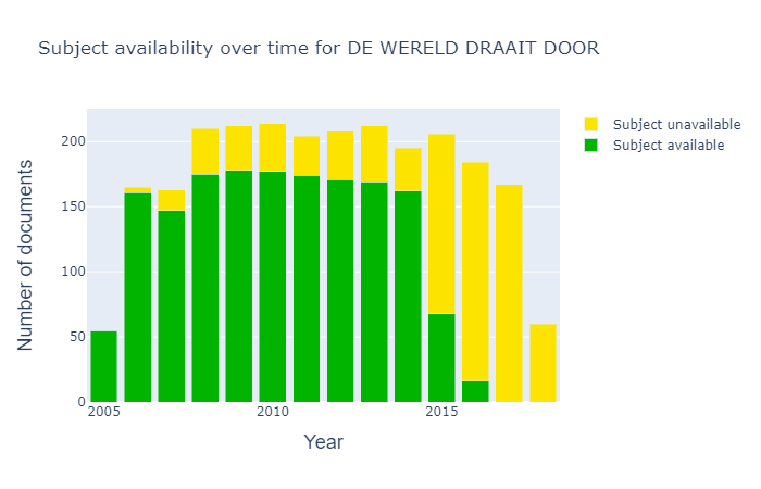
Figure 4: Overview of the availability of subject labels in DWDD over the years
Presenters
Despite not having presented right from the first broadcast, Matthijs van Nieuwkerk has become synonymous with DWDD. We were curious to see how the amount of speaking time compares between Matthijs and two talk show hosts from the same period, Jeroen Pauw and Eva Jinek. Combining the automatic speaker detection, with the programme duration, we could calculate for which proportion of the programme Matthijs van Nieuwkerk was speaking. Due to limited availability of the data, we did this calculation over the 2018 and 2019 seasons, also excluding programmes where the host was not detected at all to avoid the results being skewed by Eva Jinek’s maternity leave. While both Matthijs and Jeroen spoke for slightly under 20% of the time, Eva spoke for just under 15%. A difference in conversational style, in editing, or perhaps a difference between male and female hosts? And what effect could the speaker detection algorithm perhaps have had on the results? For example, how did it distinguish between a speaker who paused for breath, and a speaker who had stopped speaking?
Figure 5: Percentages of the programme for which the presenter is speaking

Figure 6: Speaker speeds for Matthijs (in red) and Eva (in blue), on average and during the introduction
Speech recognition
Matthijs van Nieuwkerk has a reputation for speaking quickly. But, combining speaker recognition with recognised text to calculate his speaking speed, we found that his average speed in a programme did not differ much to that of Eva Jinek, as Figure 6 shows. In the all-important introduction (which we took to be the first two minutes of the programme), however, his speed increased to 181 words per minute, whereas hers actually dropped to 165. An unconscious habit or a deliberate choice? What effect could this have on how the programme is received - and perceived - by its viewers? Or could the speech recognition have influenced the outcome, perhaps it performed better for one speaker than for another?
Visual evolution
We also wanted to look at the visual evolution of DWDD. However, fifteen years of five broadcasts a week is a lot to deal with. To cope with this amount of visual material, we looked for a way to compress it to something more bite sized. It helped greatly to focus on a constant and recognisable component of the format: the well known openingshot with crossed arms of Matthijs van Nieuwkerk!
To selectively zoom in on this part of the programme, we collaborated with our colleague Nanne van Noord, who is working on a Computer Vision pipeline for the Media Suite. Nanne used his Distributed Annotation 'n' Enrichment (DANE) pipeline to separate shots and select the ones that looked like opening shots. From here we handpicked a single frame for every month and animated them to summarise 15 years of Matthijs in 15 seconds:
Move your mouse over the image to browse through the years
Looking at the visual content of a small part of the programme this way reveals some intriguing insights. Besides the evolution of Matthijs’ face and clothing style we can spot changes in studio decor and lighting. A broader visual analysis would have been interesting, but we decided to keep it out of the scope of this project. While the main parts of the Computer Vision pipeline is automated, acquiring and analysing material involved a fair amount of manual work, which would scale badly to a full-blown analysis over the entire programme’s history.
All together now
With all the ingredients in place, the time came to bring the written story, the data visualisations and the image analysis together in a unified publication. We used a 'Static Site Generator' called Gatsby to package everything into an accessible web page. This piece of software takes in content in Markdown format and uses the styling inspired by the existing MediaSuite identity, in order to generate a static website consisting of HTML, CSS and JS. The resulting static site has no database or back-end, which makes it faster, safer and easier to deploy.
This works great on a single developer’s computer, but we also want to share our work with others. First of all, we need to collaborate among the members of our multidisciplinary team. To facilitate this, all content is version controlled in GitHub, allowing team members to add and edit files, either via the command line or the online editor interface.
As a second step, we need to publish the resulting website to make it visible for the rest of the world. We use GitHub Pages to go straight from our source code to a live website.
Lessons Learned
DWDD was a landmark programme in many ways. For our team at Sound & Vision too - producing our first data story was a voyage of discovery and we learned a great deal along the way.
Our first lesson taught us the importance of knowing the aim and audience of the story. Many choices in data selection, analysis and visualisation depend a great deal on the aim. For example, if we had only wanted to show which scientific subjects were covered by DWDD, we could have made a simple list. As we wanted to test the claim that DWDD was special in its emphasis on science, we needed to count how often these subjects were covered, and do the same with other, similar programmes to enable a fair comparison. Where we had insufficient data, we could not aim to draw conclusions, but instead used the data to propose interesting questions for further investigation.
Choices in data selection, analysis and visualisation also have a big effect on how results are interpreted, so they must be properly communicated to the reader. While a scientific audience will rightly demand a very rigorous explanation, a member of the public looking for a fun read might be put off by a lengthy description of such issues. In either case it remains vital that audiences are not misled by oversimplifications. Matching good data practice with a good audience experience is a fascinating challenge that we will examine further in future data stories.
Our second lesson was gained by serendipity. In search of what a ‘data story’ could be, we called in help from colleagues with very diverse areas of expertise. Unsure of our final destination, we opted for an agile approach: we produced our first version of the story early on, then went through a series of iterations, discussing how we could improve it and producing a new version. This allowed us to continually adjust our course. The combination of diversity with agility turned out to be a wonderful source of creativity and inspiration, and led to a final outcome which none of us could have achieved alone.